Chicken Party Game: Eggsplosion

This game was created during a semester-long project in which I led the project and contributed with design and programming.

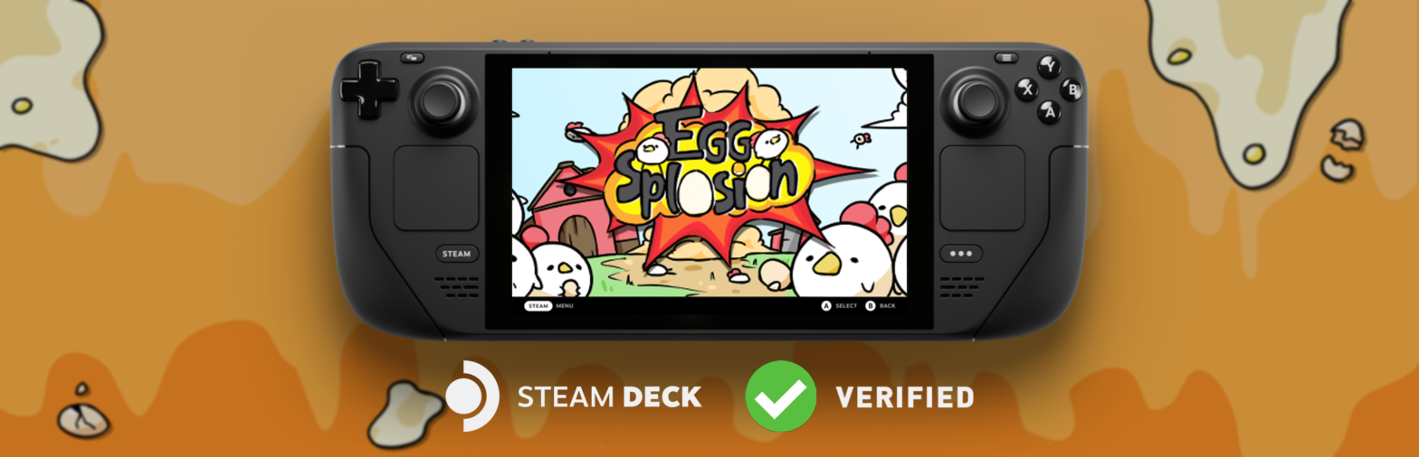
Eggsplosion is now on Steam! You can click the button down below to add the game to your library!

I have taken the lead role in this project since it started but even more so when we decided to put it up on Steam. Since then I have worked on the following things:

  • UI/UX programming and implementation
    • In-game pause menu
    • Options screen
    • Leaderboard UI handling
    • Various smaller improvements
  • Content creation
    • Gameplay trailer
    • Short video content (Tiktok, Instagram, Youtube shorts)
    • General social media (previous + Reddit, Twitter(X))
  • Steam
    • Store page
    • Game builds
    • Announcements
    • Steam Features
      • Steam Input
      • Steam Cloud
  • Project lead (and lead designer)
    • Keeping things on track
    • Managing a trello board
    • Version control
    • Communication with team
    • To-go for any issue
    • Game design

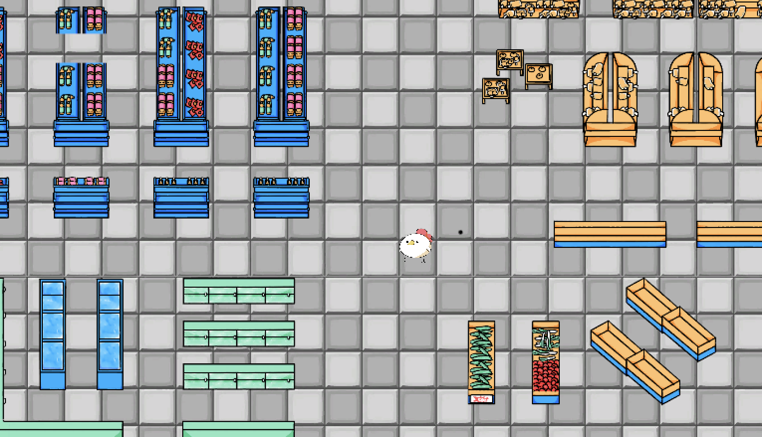
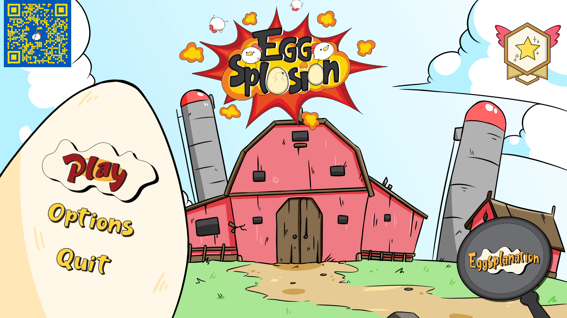
Now about the game, Eggsplosion is a local multiplayer fighting/party game in which you play as a chicken against chickens.

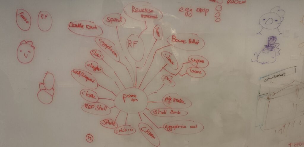
The gameplay is quick and short but a lot of fun. There are different powerups spawning around the various maps that can change your projectile type or give your character certain boosts.
Down below I will go into further detail regarding the design process and UI/UX and level design implementation.

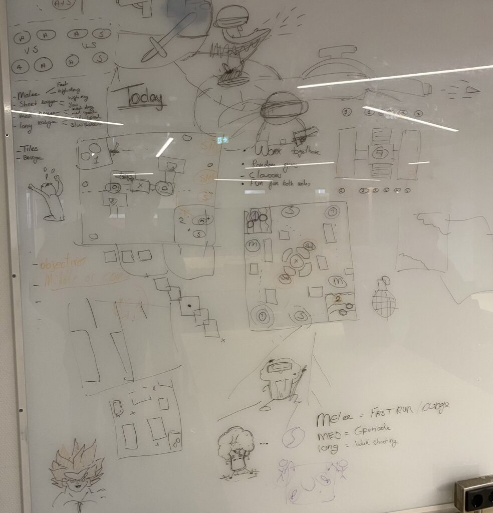
The game/level design

Specifying our chosen concept
Sketching out the first level

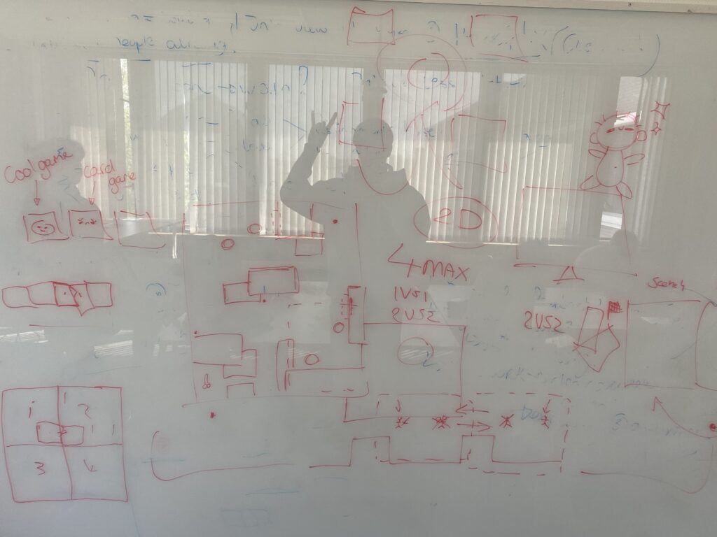
Our first brainstorm session
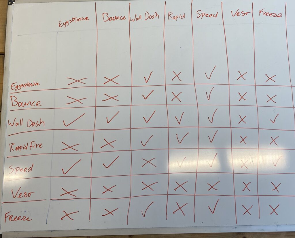
Coming up with the initial game concept

The powerup design

Brainstorming about powerups
Prioritising and categorising the powerups
Combining powerups and balancing

These sketches and brainstorming documentation eventually led us to the first real prototype of which I, unfortunately, do not have footage.

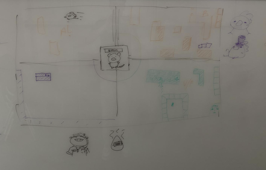
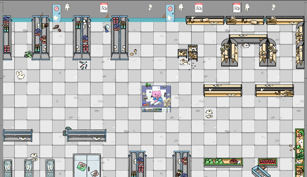
I do have a before and after for the level I worked on

I also worked on the user experience which was not my best work but I have made major improvements since my first try, at the time I did not have any knowledge of Unity’s new input system which held me back a bit.

Since then I have tested and received feedback which resulted in some big improvements. The majority of the complaints were about bad menu flow or confusing things happening.

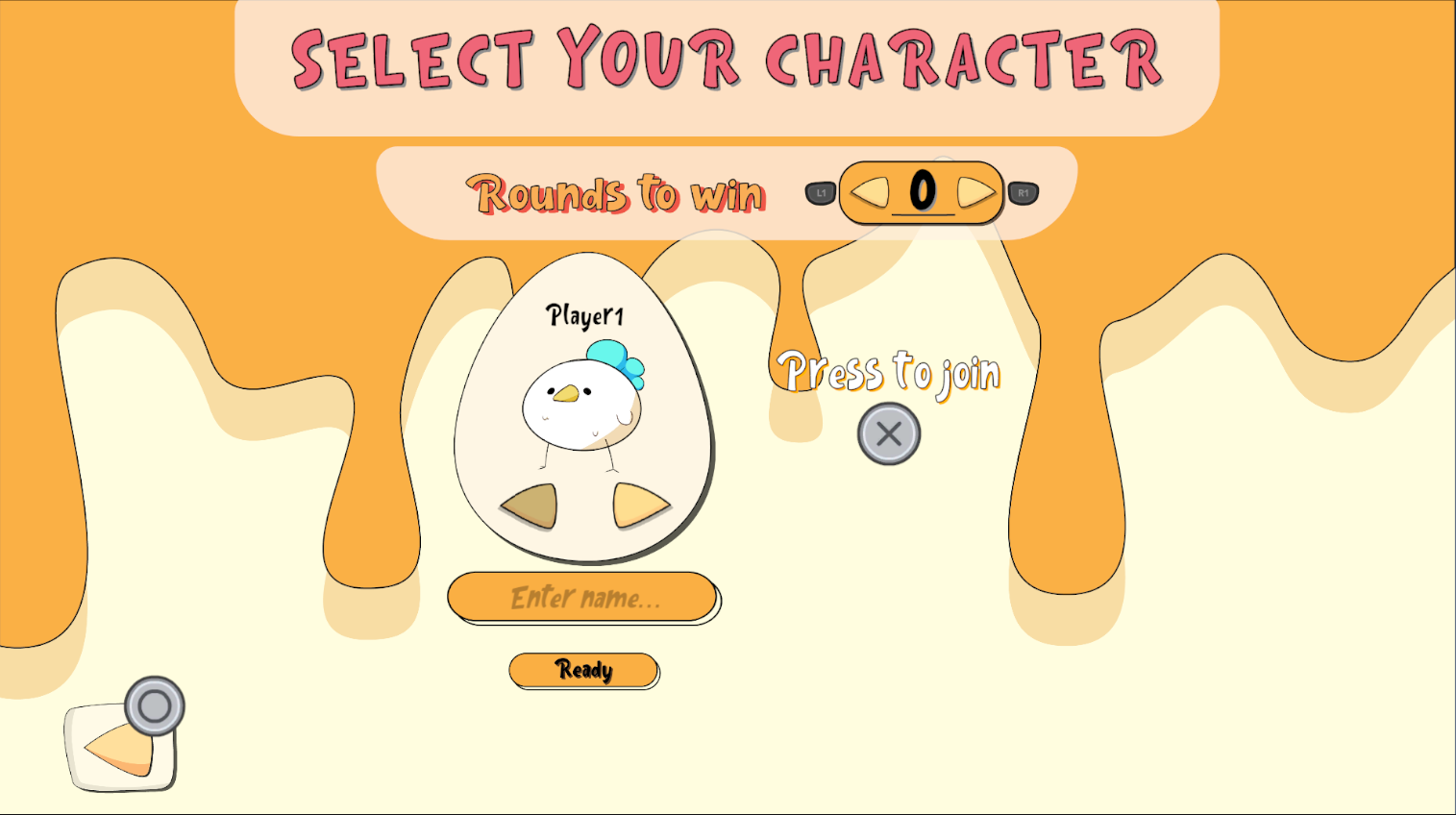
  1. There was no prompt indicating which button the player had to press to join the lobby.
  2. Also, the players had to navigate upward and click the buttons to raise the number of rounds. As our game is for controller only this was unnecessary and thus I removed it and replaced it with the shoulder buttons.
  3. I did the same for the ‘return’ button, this no longer has to be navigated to but instead the player can just press the east button on their controller.
  1. The navigation felt confusing and too responsive. To fix this I limited the navigation to the three main buttons on the left.
  2. I then opted to add button prompts and check for those inputs which would in turn invoke the button events instead.
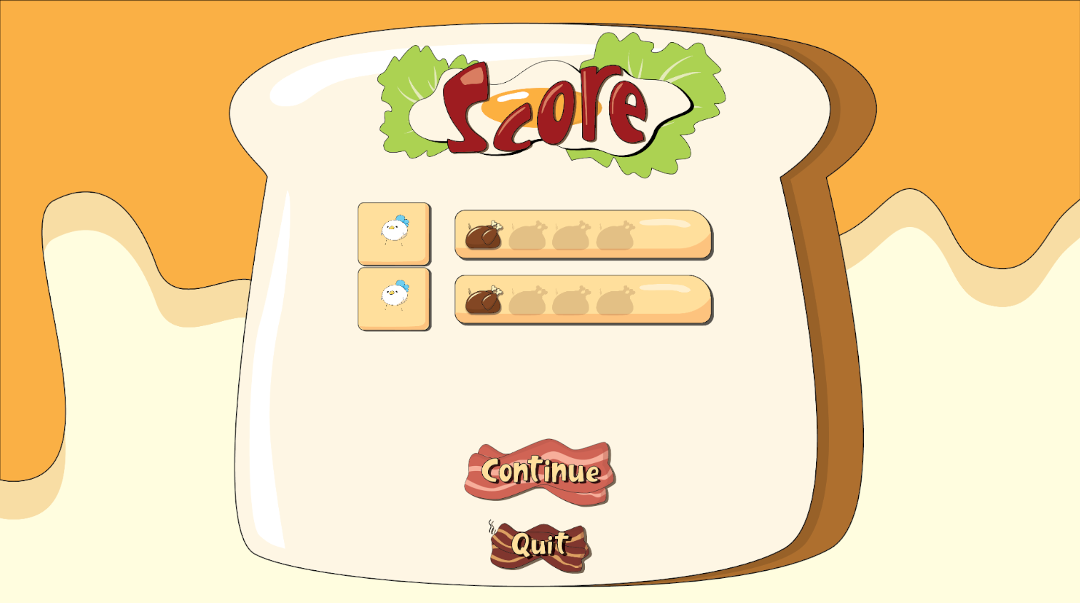
  1. This screen was visible between rounds to show the current score. However, a lot of times the players clicked the quit button which instantly took them back to the main menu forfeiting their progress up to that point. This was really frustrating.
  2. I added button prompts and removed navigation, instead the player can continue with the usual south button (X) and can return with the usual return input (O).
  3. After clicking the east button there now is an extra prompt asking you to confirm to leave the game. For the protection of the player’s current progress.

After making these additions along with several others, I felt it was time to get this game up on an actual storefront so more people will get to play it.
I then set up a team meeting and the game has since been released on Steam! Check out the trailer below.

Streaming Site Mock-Up: CMGTwitch

Introduction

This was one of the most fun courses I had this year, I really like working on UI/UX in general so getting to do that for another subject is great. Last year I scored a 9,5 for UI/UX Design. This course builds upon that one so I knew that I wanted to try and get the 10/10 this time around.

Documentation of this whole process can be found here (evaluation report) and here (product report).

Requirements

The necessary elements for this assignment were as follows;

  • Find past, current and upcoming lectures, and join them if possible.
  • Find specific topics covered in recorded lectures so they can skip to what they are looking for.
  • A built-in chat function that encourages constructive discussions rather than spam.

Research

  • Twitch
CMGTwitch

Lo-Fi Prototype

In the end, I analysed the CMGT logo to create a colour palette and based on that created a style sheet.

Then I created the first lo-fi prototype. Said prototype can be found here.

This home screen is present in my lo-fi prototype.
CMGTwitch Style Sheet

The next step was to user-test my first prototype. I did this with three other students. The main things to take away from the tests are:

  • The top bar is weird, it is incorrectly spaced and the elements feel out of place.
  • The icon for a teacher on the lecture page is too big.
  • There should be a filter to find the right module/teacher faster.

Then I worked on the hi-fi prototype. For this, I included the improvements made based on feedback from the user test, an A and B versions and a brief user functionality description.

  • The homescreen present in the hi-fi prototype.


The prototype can be found here, the form used for testing can be found here.

After letting users test my hi-fi prototype it became clear that the hypothesis was right.
Version B was in fact easier to use in terms of navigation than version A.

Creating the final prototype using HTML, CSS and Javascript. This one can be found here.

In the end, I managed to score a 10/10 on this course. It was a great subject and I really enjoyed working on UI and UX again.

Management Simulation: Food Frenzy

Personal portfolio was a rather difficult subject for me. I had so much that I wanted to do but I did not know where to start. I had many ideas, one better than the other and another way too ambitious. Not knowing better I chose the latter. One of the games I have always wanted to make was an economic simulation game with food trucks.

I created a basic setup for my game in Unity. The main things I wanted to implement were good-feeling camera movement, an object placement system and basic UI. These were the iterations that I made:

The core thing I learned from this was that functionality is more important than visuals when prototyping. This is obvious but it is something I have struggled with before as I like to make everything look decent first.

I also wanted to create three different low-poly 3D models. A food truck, a picnic table and finally a tree. As shown in the videos above already.

3D modelling is something I really enjoy, it feels as if I am drawing digitally.

Finally, the last thing I did was document the general idea of the game. The document I wrote can be found here.

Time to move on to the next part where I continued my work on food frenzy.

Side Scroller: Mud & Madness

Game Design was the first subject for which I had to create a real game on my own, work out the mechanics, the collectables, the setting, the theme and everything else. All of this was documented in a Game Design Document which you can find here.

If the embed doesn’t load or if you want to see the logic behind it, click here.

During the process, I carefully thought about what I would want the game to look and feel like. I first started documenting my thoughts, giving the main character a small backstory, creating my own pixel art and finally implementing the core aspect “capture” (which was the aspect that had to be in there to be graded)

The theme was not so hard to come up with, I had quickly decided I wanted to make a 2D platformer. I am quite fond of M&M’s and thus I chose to go with them as a theme. For the character, I created a little backstory.

He is called “M” because the second M was taken from him when the King banished him. Now your mission is to help M regain his dignity and replace the corrupt King.

This is done by finishing the three levels present in the current game, Mindful Meadow, Magical Mountain and Mythical Museum. Notice how all of these levels result in M&M when abbreviated.

To make sure that the “capture” element was present in my game I implemented a few things. According to the dictionary, capture means to collect or take control of. This is shown in all the collectables scattered around the levels. Each can be collected and award the player with a different amount of points. These points will be shown on the UI and a sound will play.

The logic behind the collectables

This subject was also the first time I made UI for a school project. I struggled a bit because I had never done pixel art before. In the end, I am quite happy with the results. I wanted to go for something inspired by wood, I wanted it to be subtle and see-through so as to not interrupt the gameplay too much.

The final UI that was implemented in Mud & Madness.

Another part I really enjoyed working on was the sound design. I found three great background tracks.

The hardest part of making this game was getting the character right, the movement was difficult to program. How high should you jump? How fast should you run? These questions were all answered during the review and feedback part of the subject. People played my game and told me what they think is good, what could and/or should be better and more.

Background music for Mindful Meadow
Background music for Magical Mountain
Background music for Mythical Museum

This subject was really one of the best subjects I had in the entire first year. I enjoyed it thoroughly because I had a lot of creative freedom and I was creating a game as an assignment. Who doesn’t like that?

If you haven’t already, please play the game and see what you think!

  • All the art assets I made for my game.