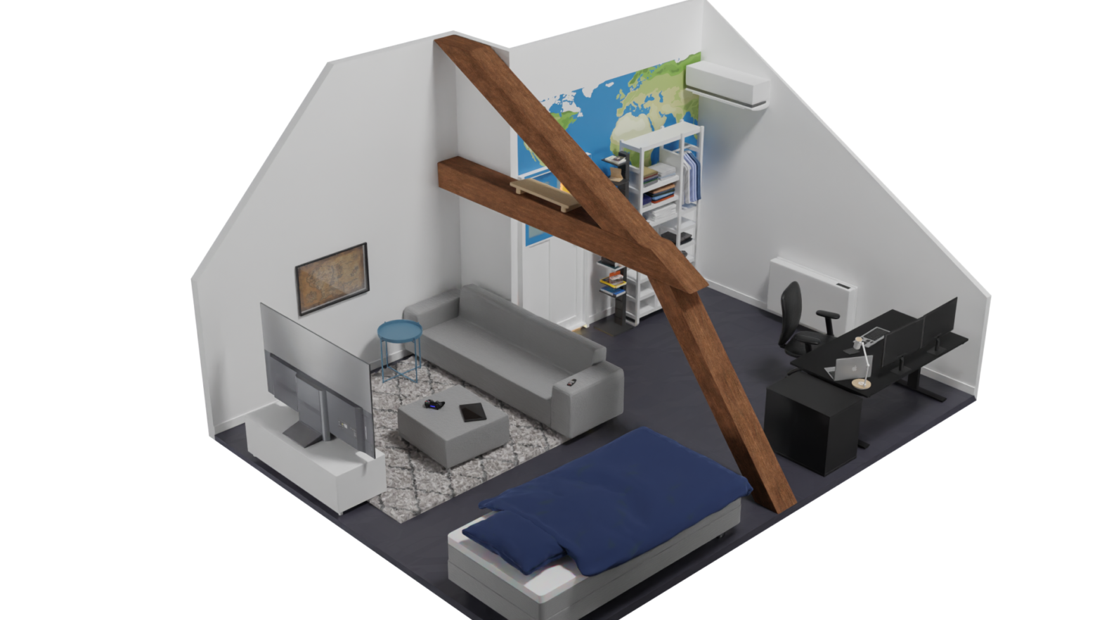
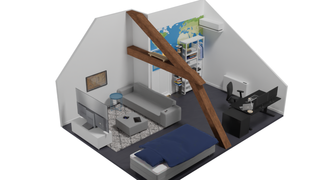
I’ve always wanted to try my hand at an isometric room design. This one got heavily inspired by one of our old bedrooms.
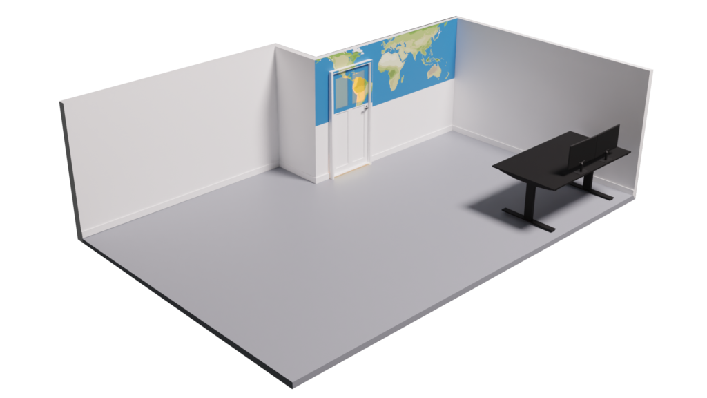
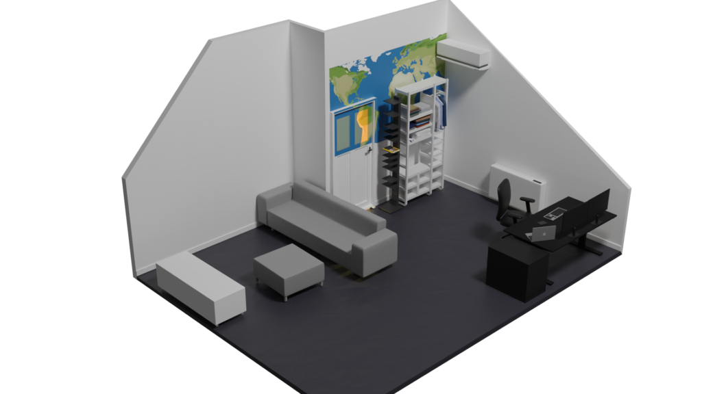
I started by creating mood boards using Pinterest. Then I followed a quick tutorial to get started and mostly went on my own from there. I worked on this project for several days, documenting the progress I had made at the end of each day, combined with rendering a final image for the day.
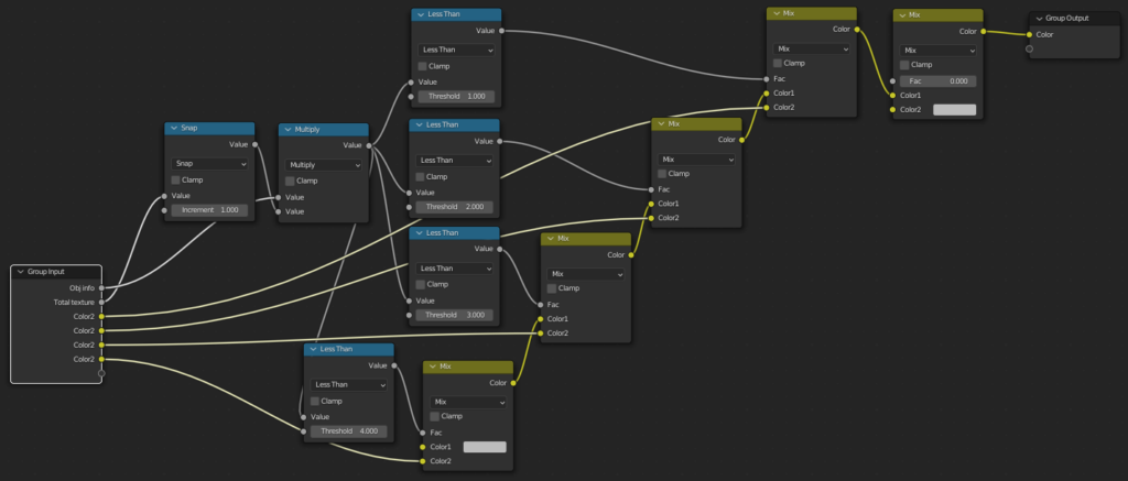
I also took the time to learn more about the material node system in Blender as I previously only used base colour- and normal maps.
After this project, I have learned how to add controlled randomness (for example for books or clothes) as well as use built-in textures to add relief to the floor for example.
An example of a node setup for a random book cover material.
This was one of the most fun courses I had this year, I really like working on UI/UX in general so getting to do that for another subject is great. Last year I scored a 9,5 for UI/UX Design. This course builds upon that one so I knew that I wanted to try and get the 10/10 this time around.
Documentation of this whole process can be found here (evaluation report) and here (product report).
Requirements
The necessary elements for this assignment were as follows;
Find past, current and upcoming lectures, and join them if possible.
Find specific topics covered in recorded lectures so they can skip to what they are looking for.
A built-in chat function that encourages constructive discussions rather than spam.
Research
Twitch
Facebook Gaming
Youtube
CMGTwitch
Lo-Fi Prototype
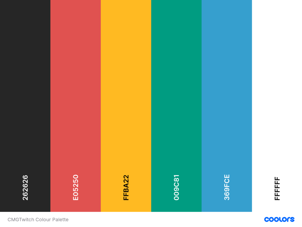
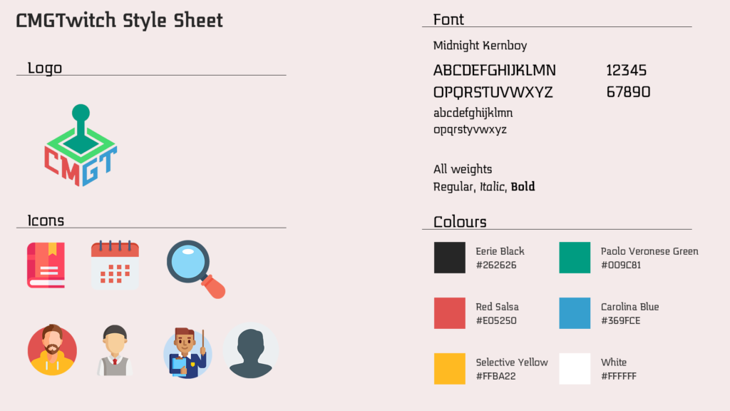
In the end, I analysed the CMGT logo to create a colour palette and based on that created a style sheet.
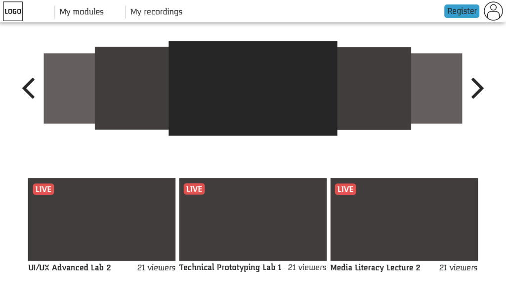
Then I created the first lo-fi prototype. Said prototype can be found here.
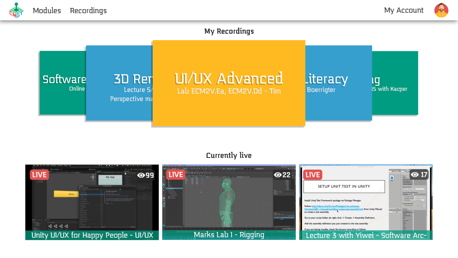
This home screen is present in my lo-fi prototype.
CMGTwitch Style Sheet
The next step was to user-test my first prototype. I did this with three other students. The main things to take away from the tests are:
The top bar is weird, it is incorrectly spaced and the elements feel out of place.
The icon for a teacher on the lecture page is too big.
There should be a filter to find the right module/teacher faster.
Then I worked on the hi-fi prototype. For this, I included the improvements made based on feedback from the user test, an A and B versions and a brief user functionality description.
The homescreen present in the hi-fi prototype.
One of the lectures present in the hi-fi prototype.
The module filter present in the hi-fi prototype.
The prototype can be found here, the form used for testing can be found here.
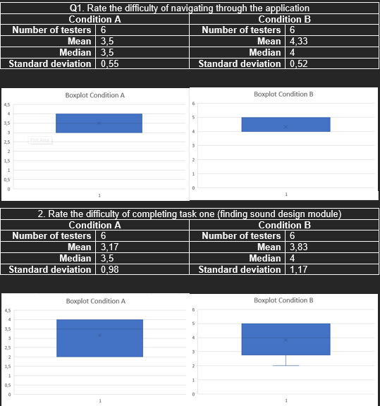
After letting users test my hi-fi prototype it became clear that the hypothesis was right. Version B was in fact easier to use in terms of navigation than version A.
Creating the final prototype using HTML, CSS and Javascript. This one can be found here.
In the end, I managed to score a 10/10 on this course. It was a great subject and I really enjoyed working on UI and UX again.